Visualization can be viewed here
Summary
This visualization attempts to encode the growth in size and scope of the scientific boundary for multiple disciplines by using the count of published scientific papers to the Arxiv pre-publishing website as a proxy for the "size" of a given scientific boundary. Meta data is collected using Arxiv's API. The titles of each paper in a given discipline and for a given year are passed into a "Bag of Words" categorization model that sorts each paper based on its abstract into a category, or defines a new category if a new cluster in the model emerges as more paper titles are added as the years progress. Each new category that is created is "born" from a parent category, which is determined as being the existing category that is most-like the newly created category, based on the words in the labels of each category. The bubbles representing each category grow in size based on the fraction of papers within that category, and are colored according to its parent category. The goal is to not only visually represent the growth in scale of knowledge within a scientific discipline, but also the fragmentation of a discipline into greater numbers of unique specializations.
Design
Paper Count Encoding
The original design was to utilize a Mandelbrot fractal to encode the growing boundary.
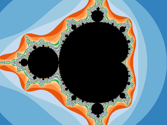
After obtaining feedback from co-workers on the original sketch, many suggested that the complexity of the fractal image took away from the main intent of the visualization.
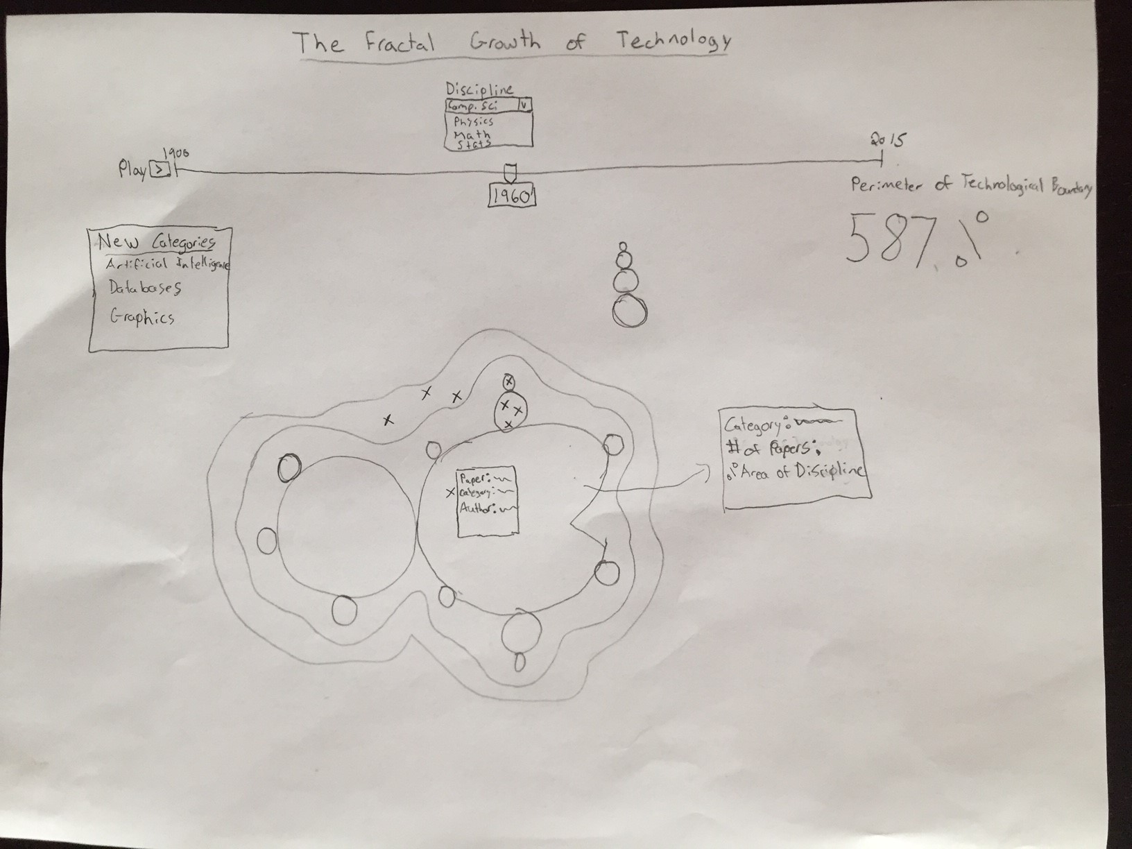
Using this feedback, the design evolved into a simpler bubble representation of the dataset.
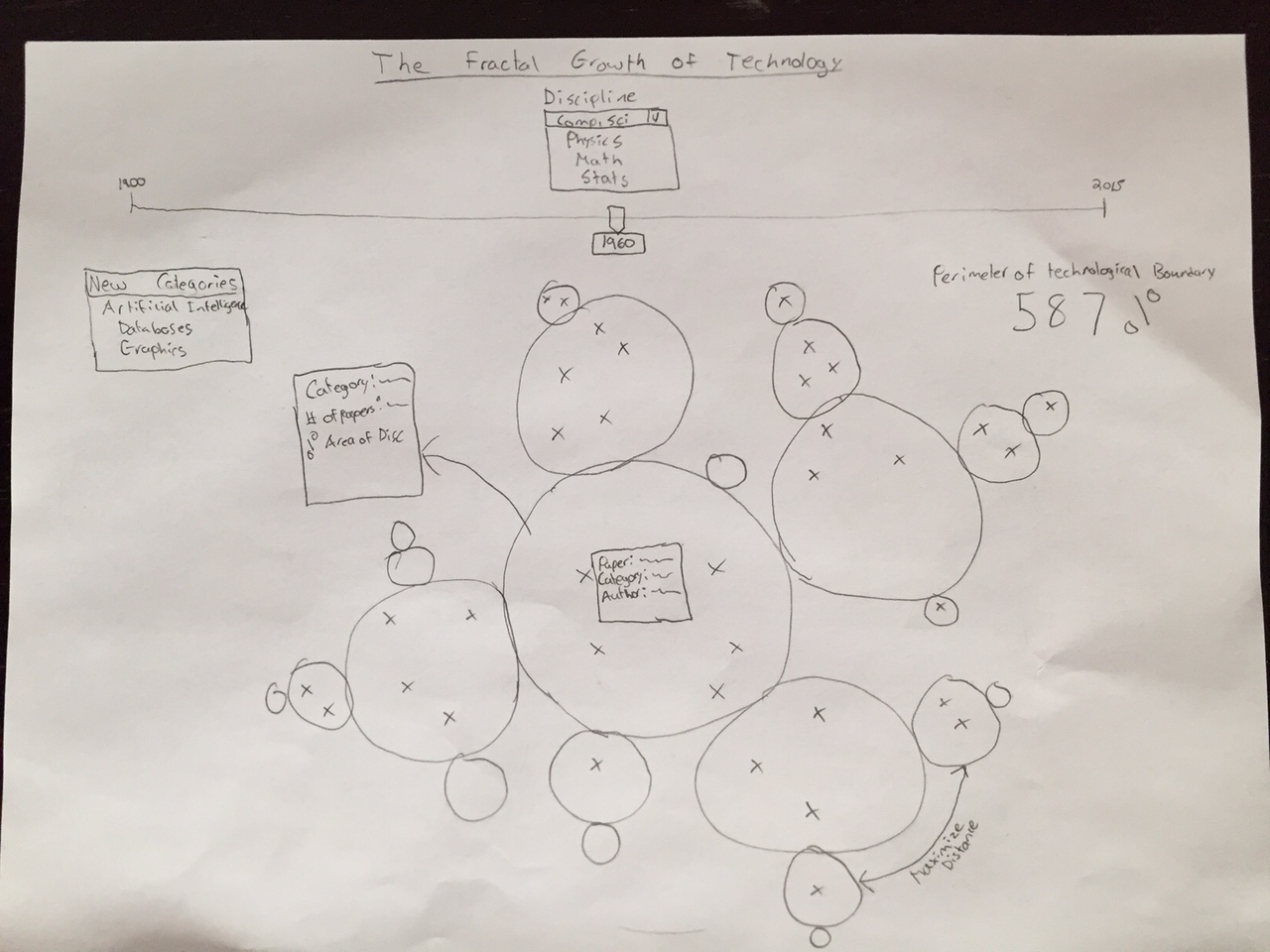
This simpler representation of the dataset provides intuitive understanding of the data remaining visually appealing.
Legend
Originally, each category was uniquely colored and identified in a legend. After reviewing, it was discovered there were too many categories to effectively distinguish using color and also that coloring each category did not provide additional information as a user could identify each category with a tooltip label. The decision was made to color each category based on its parent category. This providing additional context to the visualization, providing the ability to quickly identify which categories developed from a given parent category.
Feedback
Initial Feedback
Before formally developing the visualization, I received feedback on the conceptual sketch of the Mandelbrot fractal representation. Showing this to a couple co-workers, the main feedback received was the apparent complexity of the visualization and whether a simpler representation would be just as effective. Using this feedback, I did some research of d3.js visualizations looking for inspiration and stumbled upon this visualization that seemed suitable for my purposes. Incorporating this feedback into the design led to the current final version of the visualization
Original Published Visualization Feedback
After building out the conceptual visualization using d3.js and publishing, I received feedback from akmoore on the Udacity forums that included: 1. Adding visualization description detail to the main visualization page 2. Animating the year slider 3. Adding a stemmer to the categorization model 4. Keeping the parent category legend color consistent as the years progress
I incorporated all but 1 of the recommendations in the final design. Although the suggestion 4. to keep the parent category legend colors consistent is a valid recommendation, it requires a trade-off in the d3.js implementation of the visualization to either keep the colors consistent, or keep the categories with the same parent category spatially close to each other. After reviewing the suggestion, I decided to keep the categories with the same parent categories spatially close as to allow the user to easily identify categories with the same parent category.
Initial Submission Feedback
The initial submission for this project recieved 6 points of feedback: 1. Keeping the parent category legend color consistent as the years progress - this suggestion was implemented and successfully maintains color consistency while keeping categories with the same parent category spatially close to each other 2. Keep relative circle size based on paper count consistent - Recommendation implemented by changing the "category_ratio" scale from log to sqrt. Although still not perfect, it provides a balance between keeping sizes relatively similar but preventing really small categories from being so tiny that they are barely visible. 3. Add details about number displayed in circle - Updated title to provide more detail 4. Add extra hint that slider can be manipulated by user - Slider animation and Cross-Hair selector should give enough clues to user 5. Bug in header prevent slider selection - Updated title to prevent this bug 6. Usability bugs with tooltip and random paper details - Updated tooltip to descripe a random paper is selected and removed bug that makes tooltip reappear after mouseleave event.
Resources
Code modified and inspired from:
http://bl.ocks.org/mbostock/4063269
http://bl.ocks.org/zanarmstrong/ddff7cd0b1220bc68a58
http://colorbrewer2.org/
http://www.d3noob.org/2013/01/adding-tooltips-to-d3js-graph.html