Introduction
The Daily Fantasy Sports (DFS) industry has exploded in popularity in recent years, largely due to the exponential growth of users playing on industry titans such as Fanduel and DraftKings. These platforms allow users to gamble real money by selecting a set of players known as a roster from a sport, with rules constraining the total salary and specific player position types required for a selected roster.Each player in the roster can accumulate points based on their performance in the sport in the upcoming game that day.The user then enters this roster into contests against other users who have also entered their rosters, with the aim of selecting the roster that accumulates the most points based on the competitions set rule for point accumulation. The user or subset of users with the top accumulated points at the end of the competition win the pot of money entered by each user in the competition. With the large amount of data now available for multiple sports, and a platform to utilize that data on, this analysis attempts to explore the potential predictive parameters available in generating a successful roster for DFS competitions with the ultimate aim to project roster points and select the optimal roster for a given competition. The analysis is constrained to MLB competitions on Fanduel.
Data Structure and Sources
Data that will be used in this analysis comes from 3 sources:
- Historical baseball game and player data -
XMLStats
- Historical team lineup data - Baseball Press
- Historical Weather Data - Wunderground
The data from the above sources has been munged and combined to produce a structured data set for each player. The structures are split into two categories representing the two major player types of baseball competitions: batters and pitchers.Both batter and pitcher data is organized into a data frame of the following structure:
[Player GameID Player Stats Weather_Data Lineup_Data]
Player and GameID makeup the unique data key for each record of the data frame
Player Stats data are individual data frame columns of each stat for the player (ie. homeruns and hits for batters, era and strikeouts for pitchers)
Weather data contains a dataframe column "wunderground_forecast" that contains a dictionarty of {'wind': {'wind_speed': 1.53, 'wind_dir': 206.67}, 'temp': 72.67, 'humidity': 19.33}
LineupData contains 2 dataframe columns home_starting_lineup and away_starting_lineups both of with contain dictionaries of {u'Hyun-Jin Ryu_batter': {'batting_order': '9', 'arm': u'R'} for each player in the starting lineup.
Initial Investigation Plan
The initial instinct is to jump right into combining various parameters, plotting there relationships and reviewing their plots. However, a clearer definition of the goal is required to better frame the direction and good questions to ask of the Exploratory Data Analysis of the MLB player dataset. The Fanduel scoring rules use the following functions to calculate each players score:
batters_FD_points = singlesx1+doublesx2+triplesx3+home_runsx4+rbix1+runsx1+walksx1+stolen_basesx1+hit_by_pitchx1+(at_bats-hits])x-.25
pitcher_FD_points = winx4+earned_runsx-1+strike_outsx1+innings_pitchedx1
Knowing this, there seems to be 2 approaches one could take in
attempting to develop a predictive model for projected player points:
1. Develop an analog function of fanduel scoring rules that attempts to
directly estimate projected player points with the models own internal
parameters.
2. Develop a model that projects the predicted value for each of the
parameters in the fanduel player point function and plugging them into
the function to calculate a players projected points.
Knowing that the ultimate goal is to develop a predictive model and that in doing so will require a choice between the above 2 options, this analysis will help provide an exploration and give guidance on pathways to begin developing the model with.
We will first explore the univariate distributions of fanduel points, batter and pitcher data and observe any interesting features in the plots. We will then explore bivariate datasets to discover relationships between parameters with a focus on their impact on fanduel points. Lastly, we will further combine parameters into multivariable datasets and try to discover any interacting relationships across parameters. Using the patterns and relationships discovered in this analysis will inform the development of a predictive model.
Data Prep, Imports and Utility Functions
All column histogram code from Stackoverflow
Univarate Parameter Analysis
Player Fanduel Points

##    Min. 1st Qu.  Median    Mean 3rd Qu.    Max.
##  -1.750  -0.250   0.250   1.529   2.500  27.750

## Standard Deviation =  2.695974

##    Min. 1st Qu.  Median    Mean 3rd Qu.    Max.
##  -9.000   1.000   2.000   3.565   4.200  30.000

## Standard Deviation =  4.733862
For batters, the distribution of FD_points seems to follow a decaying distribution, while pitchers FD_points seem to be somewhat normally distributed with a longer positive tail.This right-side-scew in the batters distribution is quantified with the large distance between the median and 3rd quartiles compared to the 1st quartile. The 1st quartile is only 1/5th of a standard deviation from the median, whereas the 3rd quartile is 1/3rd of a standard deviation from the median. Compared to the more normally distributed pitchers distribution, where the 1st quartile and 3rd quartile are 1/5th and 1/4th of a standard deviation from the median respectively, quantifies it as being closer to a normal distribution with a longer right-side tail. A repeating pattern in the batter distribution that has a local maximum is likely due to the biases created in the scaling of the batters scoring function. This information might help in deciding to round model outputs to the discrete possible ouputs of the scoring function. For both batters and pitchers, there is a large number of 0 valued FD_points due to the inclusion of players that did not participate in a game. This will need to be considered as the dataset is explored further.
Batters

The first observation from the above plots is the obvious discrete and and low-variability nature of the data for many player stats. This observation makes logical sense, as the game of baseball is made up of many rules framed around discrete events. A player can run to only 1 of 4 bases, plate appearances are scheduled in the lineup order and there is a limited subset of events that can occur in any one plate appearance. There are some parameters, such as total bases, plate appearances and the more advanced stats obp, slg, and ops that have a less discrete nature and may warrant further exploration.
Pitchers

Many of the pitchers stats show the same characteristic of batters in the discrete and low-variability nature. The pitching stats count and strikes have interesting double hump distributions that may be attributed to a select few pitchers that usually pitch a full 8 or 9 innings.
The discrete nature of the parameters that are used in the Fanduel scoring functions leads me to believe it will be difficult to accurately develop a model based on predicting each individual input parameter. For example, the difference between 0 and 2 runs is small, but the impact on point projections and ultimately selecting the optimum roster could be large. The distribution of FD_points more readily lends itself to regression analysis, suggesting that developing an analog function predicting player fanduel points may produce better results than directly predicting the input parameters. Alternatively, it may be possible to develop a hybrid of the two options, using classification of the discrete inputs as features in the regression model.
Bivarate Parameter Analysis
We know that the player statistics included in fanduel's scoring function will have a linear relationship with fanduel points, as dictated by the form of fanduel's scoring equations. For example, batters rbi's and pitchers strikeouts. Code adapted from R-Cookbook

## r2 = 0.9910313

## r2 = 0.9967708
The strong linear relationships, with r2's of 0.99 for both rbi and strike_outs is obvious and not very informative, as the linear relationship of these parameters is built into the fanduel scoring equations, and by definition are linear relationships of fanduel points. As was discussed above, it will likely be difficult to accurately predict the individual parameters in fanduel's point function. What is of more interest will be the relationships between the more advanced player statistics and FD points.
Advanced Stats
Batters
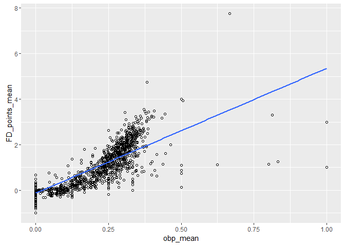
## r2 = 0.7054033
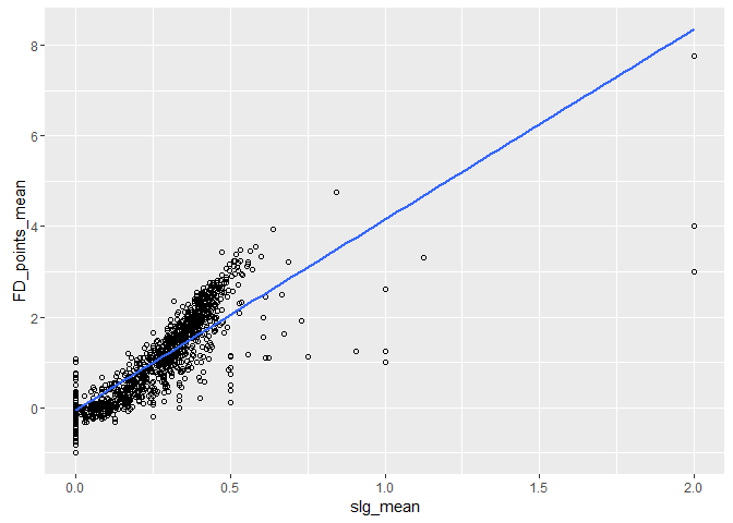
## r2 = 0.7736614
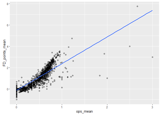
## r2 = 0.7834183
It appears the advanced stats for batters may be following a more quadratic or exponential relationship then linear, with the linear regression r2 values being 0.70, 0.77 and 0.78 for obp,slg and ops respectively. I had originally guessed the relationships would have very strong linear relationships with r2's closer to 1, so it is good to discover something counter thesis to my intuition in this data exploration. The fact that the relationships seem quite similar is expected, as the advanced stats are closely related.
Cleaning up some of the outliers and applying a regression to the batters slg vs FD_points stats seems like a good candidate for closer inspection in the more detailed section of this analysis.
Pitchers
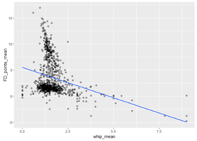
## r2 = 0.07168485
The only advanced stat for pitchers in this dataset is their WHIP. A clear pattern is hard to determine from this plot, with a potential linear or logarithmic relationship that has a strong clustering in the bottom left quadrant of the graph. The low rsquared linear regression value of 0.07 shows that building a linear model with the WHIP parameter in it's current state will not be very useful, and other data transformations may be required. The large variation in the scatter of this relationship may mean that whip will not provide usable information in creating a predictive model, but it may be possible to combine whip with another feature to give it stronger predictive power. One option could be to find the characteristic(s) of a pitcher that causes him to cluster into the lower left quadrant of this plot. We could then run a clustering classifier on pitchers, that produces as a result the pitcher either does or doesn't clump into the lower left quadrant. If he does, we assign him a default prediction value (ie the mean of the cluster). If he doesn't, we can then apply the linear/logarithmic function as a prediction for the players that do not seem to cluster. This will require further exploration in the modelling stage.
Weather
As some MLB baseball diamonds are outdoors, the weather may have an impact on player performance. The below plots investigate temperature and humidity for batters and pitchers. Wind will be investigated in the multi-variate analysis, as direction and speed will come into play. The decode_wg_weather utility function is used to parse out open air stadiums only and decode the wunderground weather json data.
Batters

This plot is clearly not very useful, but does show that the wundeground weather temperature data contains some wonky data with large negative values seen in the dataset. Cleaning up these outliers and 0 valued temps and moving to box plots:
batter_data.OD.decoded$bin_temp <- cut(batter_data.OD.decoded$temp,
                                       c(25,35,45,55,65,75,85,95,105))
temp_groups <- group_by(batter_data.OD.decoded,bin_temp)
batter_data.temp_meds <- summarize(temp_groups,
                                   FD_points_median = median(FD_points))
ggplot(batter_data.OD.decoded, aes(x=bin_temp, y=FD_points)) +
  coord_cartesian(ylim = c(-2, 10)) +
  geom_boxplot() +
  geom_text(data = batter_data.temp_meds,
            aes(x = bin_temp, y = FD_points_median,
            label = FD_points_median),
            size = 3, vjust = -1.5)

It's difficult to say if temperature has any affect at all on a batters FD points, with median values being quite similar across all temperature bins. There may be a slightly quadratic relationship with the median values being higher at the cold and hot edges of the temperature distribution, but further work will be required to prove if this is useful for the predictive model.

Again, humidity seems to have very low impact on a batters FD_points with median values being very similar across all humidity bins and no desernable pattern in the boxplots.
Pitchers
Pitchers may be more affected by weather then batters.

With a median of 2 FD_points for all temp bins, the lack of a clear trend in FD_points vs temp for pitchers matches what was seen for batters and does not seem to be very as a predictive parameter.

Humidity also seems to provide little predictive power for pitchers FD_points, with medians of 2 persisting in each humidity bin.
It does not appear that weather (temp and humidity) have a very big impact on a MLB players FD_points. This data may be useful to create a classifier that determines if a game will be rained out, as selecting players from a postponed game will greatly affect the roster performance (ie. selected a player that ends up with 0 FD_points) and may need to be explored further during model development.
Multi-Variate Analysis
There may exist interactions between parameters that reveal interesting relationships we can take advantage of for model development.
Wind
The first multi-variate parameter investigated will be the impact of wind speed and direction on players FD_points. The function wind_spiral_plots is defined to parse the data into 6 windspeed bins, calculate the mean FD_points for each wind_angle per windspeed bin and plots the spiral plot of angle vs mean FD_points for all 6 windspeed bins. There likely exists a more elegant solution then the current functions code, but the functionality is adequate. I'll need to sharpen my R coding skills and come back to refactor this function at a later date.
#Function to parse dataframe wind data and
#create spiral plots based on wind angle and FD_points.
wind_spiral_plot <-function(df){
  wind_speed_bins = c(-Inf,4,6,8,10,12,Inf)
  df$bin_wind_speed = cut(df$wind_speed,wind_speed_bins) #Bin wind speeds
  df.wind_speed_groups = split(df,f=df$bin_wind_speed)
  wind_df = data.frame()
  #Loop through each wind speed dataframe
  for(i in 1:length(df.wind_speed_groups))
    {
      wind_dir_groups <- with(df.wind_speed_groups[[i]],
                      cut(wind_dir,c(0,25,50,75,100,125,150,175,
                                     200,225,250,275,300,325,359),
                          include.lowest = TRUE))
    dat <- aggregate(FD_points ~ wind_dir_groups,
                     data = df.wind_speed_groups[[i]], FUN = mean)
                    #Summarize FD_points per wind angle
    dat$wind_speed_group_indx = wind_speed_bins[i]
    wind_df<-rbind(wind_df,dat)
    }
  return (ggplot(wind_df,aes(x = wind_dir_groups, y = FD_points)) +
      geom_bar(stat='identity') + coord_polar(start = 0) +
      facet_wrap(~wind_speed_group_indx))
}
Batters

There appears to be some effect of wind speed and direction on batters fanduel points that may prove useful as a feature for model development. Some wind speeds seem to have spikes in FD_points in the upper left quadrant, while others show spikes at many angles. More work will need to be done to prove the significant of a relationship, as well a doing a more detailed investigation to analyze the effect of wind for individual ballparks. This will be looked at in the more detailed section of this analysis.
Pitchers

Pitchers do not seem to be as affected by wind speed and direction as batters, with few obvious spikes or variations in FD_points at different speeds and angles. Wind data may not prove to be an informative parameter for the predictive model, but a more granular investigation at a per ballpark level should be conducted.
Detailed Plots and Analysis
Three plots have been identified that warrant further investigation:
1. Batter FD_points vs SLG to test regression models
2. Pitcher FD_points vs WHIP to better identify clustering and trend in
the relationship
3. Batter wind data spiral plots to better understand the significance
and strength of the effect wind has on batter performance
Batter FD\_point vs SLG
Batter FD_points vs SLG was chosen in the final plots section as it displayed a potentially quadratic or exponential relationship, that if properly defined, could prove useful in building a predictive model.
Code adapted from Stackoverflow
batter_data.adv_stats_mean.clean = subset(batter_data.adv_stats_mean,
                                          isnumeric(slg_mean) & slg_mean >
                                            0 & slg_mean < 0.7)
                                            #clean up NA and outlier values
y = batter_data.adv_stats_mean.clean$FD_points_mean
x = batter_data.adv_stats_mean.clean$slg_mean
xy = batter_data.adv_stats_mean.clean
linear <- lm(y ~ x, data = xy)
quadratic <- lm(y ~ I(x^2), data = xy)
exponential <- lm(y~I(exp(x)),data=xy)
linear_r2_text = paste("lin_",
                 toString(round(summary(linear)$r.squared,digits=2)))
quadratic_r2_text = paste("quad_",
                    toString(round(summary(quadratic)$r.squared,digits=2)))
exponential_r2_text = paste("exp_",
                      toString(round(summary(exponential)$r.squared,digits=2)))
r2_text = paste(quadratic_r2_text,exponential_r2_text,linear_r2_text,sep="\n")
prd <- data.frame(x = seq(0, 0.7, by = 0.05))
result <- prd
result$linear <- predict(linear, newdata = prd)
result$quadratic <- predict(quadratic, newdata = prd)
result$exponential <- predict(exponential, newdata = prd)
result <-  melt(result, id.vars = "x", variable.name = "model",
                value.name = "fitted")
ggplot(result, aes(x = x, y = fitted)) +
  theme_bw() +
  geom_point(data = xy, aes(x = x, y = y)) +
  geom_line(aes(colour = model), size = 1) +
  annotate("text", x = 0.65, y = 3.5, label = r2_text) +
  xlab("Batter SLG %") +
  ylab("Fanduel Points") +
  ggtitle("Batter Fanduel Points vs SLG %") +
  ylim(c(-1,4))

The cleaned up version of batter FD_points vs SLG plot shows that the initial impression of a highly quadratic or exponential relationship may not have been accurate. The R2 for a linear model is nearly identical to that of a quadratic, with an exponential regression being the worst r2 of the models. More advance outlier cleaning techniques may be required during model development.
Pitcher FD\_points vs WHIP
Pitcher FD_points vs WHIP was chosen to include in the final plots section, as WHIP is currently the only advanced stat for pitchers in the dataset and showed an interesting distribution in the scatterplot, that if properly classified into clusters could provide useful for grouping pitchers into fanduel point ranges for use in a predictive model.
Circle function from Stackoverflow
circleFun <- function(center = c(0,0),diameter = 1, npoints = 100){
    r = diameter / 2
    tt <- seq(0,2*pi,length.out = npoints)
    xx <- center[1] + r * cos(tt)
    yy <- center[2] + r * sin(tt)
    return(data.frame(x = xx, y = yy))
}
pitcher_data.adv_stats_mean.clean = subset(pitcher_data.adv_stats_mean,
                                           isnumeric(whip_mean) & whip_mean >
                                             0 & whip_mean <=5)
                                          #clean up NA and outlier values
dat <- circleFun(c(1.4,1.38),1.6,npoints = 100)
ggplot(pitcher_data.adv_stats_mean.clean, aes(x=whip_mean, y=FD_points_mean)) +
  geom_point(shape=1) +
  geom_path(data=dat,aes(x,y),color="red",size=2) +
  xlab("Pitcher WHIP") +
  ylab("Fanduel Points") +
  ggtitle("Pitcher Fanduel points vs WHIP") +
  ylim(c(-5,15))

Cleaning up the pitcher WHIP data for outliers and plotting the results magnifies the clustering that occurs at the lower left of the dataset, and also shows a possible logarithmic trend for data points outside the cluster. It may be possible for the model to develop a automated cluster classification and apply a logarithmic regression to pitchers that fall outside this cluster as part of the predictive model.
Batter Wind Effects
Batter wind effects were chosen for inclusion in the final plots section as some variation in fanduel points vs windspeed and direction were seen in the plots. This advanced relationship could prove to be an edge in predictive models over competing models that not account for the potential wind relationship in predicting batter fanduel points.
Utilizing the wind_spiral_plot function defined earlier and refining:
wind_spiral_plot_formatted <-function(df){
  wind_spiral_plot(df) +
  aes(fill=wind_speed_group_indx) +
  guides(fill=guide_legend(title="Wind Speed m/s")) +
  ggtitle("Batter Fanduel points vs Wind speed and Direction") +
  scale_x_discrete(breaks=c("(75,100]","(150,175]","(275,300]",
                            "(325,359]"),
                   labels=c("(75,100]"="75","(150,175]"="150",
                                             "(275,300]"="275",
                                             "(325,359]"="325")) +
  theme(strip.background = element_blank(),strip.text.x = element_blank()) +
  xlab("") +
  ylab("Fanduel Points")
}
wind_spiral_plot_formatted(batter_data.OD.decoded)

There are some large outliers in FD_points at windspeeds of 2m/s, 10m/s and 12m/s, which may prove useful in a predictive model.Further analysis is needed to explore each ballpark and it may be beneficial to normalize the dataset to ballpark homeplate direction, but the inclusion of wind as an advanced parameter in the predictive model may prove to be an advantage of simpler competing models.
Reflection
Being a dynamic sport, with so many variables and events, parsing and exploring the MLB dataset proved both challenging an insightful. The biggest challenges in this analysis included manipulating data from multiple sources and formats, and coercing that data into useful and interpretable visualizations. Coming up with an idea of a beautiful plot is the easy part; mangling the data and actually building the plot takes effort and many iterations to obtain a refined product. Two specific challenges included unraveling the json wunderground weather dataset into usable data for plotting. This took some advanced R decoding functions and long hours of debugging multiple errors. Another challenge was in learning R-programming syntax in general, especially ggplot2 use cases. Many hours were spent goggling different methods in attempts to create the plots shown above, and many others not shown that did not produce the expected result. After a lot of trial and error, successful methods of generating the desired plots were found. As the analysis progressed, the number of trials before success decreased, as I began to get a more intuitive understanding of the R and ggplot2 syntax. The ability to continuously add layers to a plot is very cool, and I'm especially proud of the wind_spiral_plot_formatted which takes the returned ggplot of the wind_spiral_plot and expands on it to refine the plot. I can imagine there being a lot of interesting use cases with this kind of functionality.
This analysis provides many useful insights for a starting point to develop a predictive model. It provided support in the decision to develop an analog model of FD_points instead of attempting to predict the FD scoring function inputs directly. It showed both advanced stats and wind for batters seem informative, and displayed paths that may not be valuable to pursue, such as wind parameters for pitchers. Being as dynamic as it is, there are many, many more parameters and relationships to be explored for building a MLB FD_points predictive model. The most obvious omission in the above analysis is its lack of investigation into the impact of oppositional teams on a players FD_points. For example, exploring a batters points vs a low WHIP pitcher, or a pitchers points versus a high scoring team. These relationships will need to be explored before a optimal predictive model can be develop, but will require further data munging to align the dataset for that sort of analysis. That will likely be the subject of a future analysis.